When the first chill of autumn touches the air and the vibrant greens of summer begin to fade, a new world of color unfolds before us — deep golds, rich browns, burnt oranges, and muted greens. This transformation of nature inspires what we call the fall color palette — a collection of hues that embody warmth, comfort, and an earthy sophistication. The fall palette is not just a trend; it’s a reflection of human emotion during the season of change. It symbolizes transition, grounding, and maturity. Whether you apply it to fashion, home décor, graphic design, or art, the fall palette offers a feeling that’s both timeless and deeply comforting.

What is the Fall Color Palette?
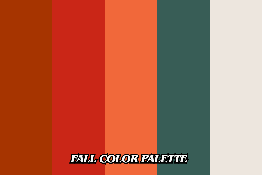
The fall color palette is inspired by the natural changes of the season — from golden leaves to crisp pumpkins and soft amber sunlight. These colors typically include tones such as burnt orange, mustard yellow, chestnut brown, olive green, aubergine, warm taupe, and creamy beige. The beauty of the fall palette lies in its depth and richness. Unlike the bright and airy colors of spring or the cool tones of winter, autumn hues have a grounded, mature quality that feels cozy and authentic.
In design terms, the fall color palette is defined by warmth and low saturation. These shades often contain red or yellow undertones that make them appear inviting and organic. Designers and artists love to work with these hues because they blend harmoniously — creating compositions that are balanced, earthy, and soothing to the eye. Whether it’s a soft pumpkin hue on a sweater or an olive accent wall in a living room, these colors connect us to the beauty of nature’s cycle.
The Emotional Connection of Fall Colors
Color psychology plays a major role in why the fall palette feels so special. Warm colors like rust, ochre, and brown evoke a sense of comfort, nostalgia, and belonging. They remind us of harvest time, cozy fireplaces, and family gatherings. These shades can calm the mind and create a sense of safety — which is why they are often used in interior spaces where relaxation and warmth are desired.
In fashion, people are naturally drawn to autumn tones during the cooler months because they not only reflect the outside world but also enhance the complexion in soft lighting. Mustard yellows bring energy without being overpowering, while deep burgundies and browns give a feeling of sophistication. In essence, the fall palette is emotional — it speaks of coziness, confidence, and natural elegance.
Fall Color Palette Bio Table
| Feature | Details |
|---|---|
| Name | Fall Color Palette |
| Also Known As | Autumn Palette |
| Origin | Inspired by nature’s autumn season, changing leaves, and harvest tones |
| Main Colors | Burnt orange, mustard yellow, olive green, chocolate brown, aubergine, warm taupe, cream |
| Color Characteristics | Warm, earthy, muted to medium saturation, low contrast |
| Common Uses | Fashion, interior design, branding, art, graphic design |
| Psychological Effect | Evokes warmth, comfort, coziness, grounding, and sophistication |
| Popular Subtypes | Soft Autumn, True/Warm Autumn, Deep Autumn |
| Modern Adaptations | Inclusion of dusty rose, muted teal, layered textures, digital-friendly palettes |
| Emotional Connection | Nostalgia, coziness, nature, seasonal transition |
| Suitable For | Autumn seasonal types, warm skin tones, cozy interior environments, lifestyle brands |
Building a Fall Color Palette in Fashion and Style
In fashion, the fall color palette offers endless possibilities for creativity and layering. Think of pairing a camel-colored coat with a rust-orange scarf, olive trousers, and chocolate-brown boots. These combinations not only feel warm but also exude elegance and timelessness. The key is balance — blending warm neutrals with deeper accent tones. A single pop of mustard or burgundy can transform a neutral outfit into a statement of confidence.
For people who follow seasonal color analysis, the “Autumn” type in personal styling includes shades that complement warm undertones in the skin. This category is often divided into sub-types: Soft Autumn (muted and gentle hues), True Autumn (classic golden and rich shades), and Deep Autumn (darker and more dramatic tones). If your skin tone carries golden or peachy undertones, autumn colors like olive, rust, and caramel will naturally harmonize with you.
Accessories also play an important role in the fall palette. Gold jewelry, leather belts, and earthy-toned handbags enhance the warmth of the colors. Even makeup trends shift toward deeper lip shades like burnt red, copper, and warm nude, perfectly complementing the seasonal look.
Fall Colors in Interior Design
When used in interiors, the fall palette can completely transform a space into a cozy retreat. Warm colors make rooms feel inviting and intimate. Imagine walls painted in a muted taupe or soft caramel, paired with accents like terracotta cushions, olive-green throws, or amber lighting. The mix of textures — wool, velvet, and wood — enhances the comfort that fall tones bring.
In modern homes, designers often combine warm earthy colors with contemporary neutrals like cream, warm gray, or soft beige to maintain balance. Deep shades such as aubergine or forest green can be used as accent walls, creating a luxurious yet welcoming environment. Metallic touches in brass, bronze, or copper further elevate the aesthetic, adding a subtle glow that complements the warmth of autumn hues.
The fall palette isn’t limited to rustic or vintage styles; it can be modern and chic too. Pairing terracotta with matte black or mustard with white creates a sophisticated contrast that feels both trendy and timeless. The goal is to create harmony — an environment that feels grounded, peaceful, and full of life.
Using Fall Colors in Art and Design
Artists and designers often turn to the fall color palette for inspiration because of its natural harmony. The combination of yellows, oranges, reds, and browns naturally forms what is known in art theory as an analogous color scheme, where adjacent colors on the color wheel blend seamlessly. This creates artwork that feels cohesive and organic.
In graphic design and branding, fall palettes are used to convey trust, authenticity, and warmth. Brands that focus on sustainability, handcrafted goods, or lifestyle products often choose these colors to connect emotionally with their audiences. A logo in warm terracotta or muted olive, paired with cream typography, feels genuine and approachable. These palettes also perform well digitally because they are easy on the eyes and versatile across various platforms.
Even wedding planners use the fall palette for event styling — from rustic centerpieces with dried florals to amber lighting and golden table settings. The emotional and aesthetic appeal of these colors ensures they remain relevant year after year.
The Modern Evolution of the Fall Palette
While traditional fall colors remain timeless, modern design has reimagined the palette by introducing unexpected hues. For example, designers now mix dusty rose, sage green, or muted teal into classic fall schemes to add freshness and contrast. These subtle updates give the palette a contemporary twist without losing its essence.
Digital artists are also expanding how they use fall tones. Instead of the classic high-saturation oranges, they prefer desaturated, textured hues that feel softer and more modern. This shift reflects a broader trend toward natural, sustainable aesthetics in every creative field.
The modern fall palette is no longer about nostalgia alone — it’s about expressing grounded luxury. It bridges the gap between comfort and sophistication, warmth and minimalism. Whether in a cozy living room, a fashion collection, or a digital brand identity, fall colors continue to evolve while maintaining their emotional core.
Conclusion: The Warm Soul of Autumn
The fall color palette captures more than just the shades of a season — it reflects human emotion, nature’s rhythm, and the beauty of transition. These warm, grounded hues remind us to slow down, to find comfort in simplicity, and to appreciate the world’s natural changes. They tell a story of balance: between light and dark, warmth and coolness, simplicity and richness.
When you wear autumn tones, decorate your home with them, or use them in your creative projects, you’re not just choosing colors — you’re choosing a feeling. A feeling of warmth, elegance, and connection to the earth. That’s why, year after year, the fall palette remains one of the most beloved and enduring in both art and life.
FAQs
1. What is a fall color palette?
A fall color palette consists of warm, earthy tones inspired by autumn—like rust, mustard, olive, and brown—that evoke comfort and natural beauty.
2. Why are fall colors so popular in fashion and design?
They create a cozy, sophisticated aesthetic that complements seasonal moods and flatters a wide range of skin tones and interiors.
3. How can I use fall colors in my home décor?
Incorporate warm neutrals on walls or furniture and add accents like terracotta cushions, brass lamps, and olive-green textiles.
4. Can fall colors work in branding or digital design?
Yes, fall tones convey warmth, authenticity, and trust—ideal for lifestyle, organic, or artisanal brands.
5. What colors best represent the fall season?
The most iconic fall shades include burnt orange, golden yellow, deep brown, olive green, and rich burgundy.